In industrial automation, Data Visualization is one of the most critical components that determines how effectively operators can monitor and control systems. It transforms complex technical data into clear, interactive, and real-time visuals, allowing engineers to make accurate and timely decisions. Let’s explore what Data Visualization means in HMI, why it’s essential, and how Flextech helps businesses optimize it for smarter factory operations.
What is Data Visualization in HMI?
Data Visualization in HMI (Human Machine Interface) refers to the process of converting numerical and technical data from machines, sensors, and controllers into intuitive visual formats — such as charts, trend graphs, gauges, dashboards, and indicators.
Instead of scanning through rows of values or PLC registers, operators can instantly understand the system’s performance and identify issues. Advanced HMI visualizations can also display historical trends, KPI dashboards, and dynamic reports, giving engineers both a real-time and long-term view of system efficiency.
At Flextech, our HMI systems are designed with smart visualization frameworks, allowing users to easily track key metrics like temperature, speed, pressure, or production count — all from a single, interactive screen.
What are the benefits of Data Visualization in HMI automation?
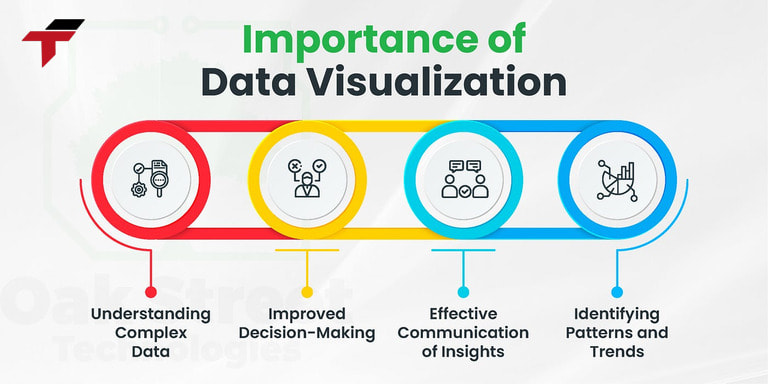
In an automated production environment, the volume of technical data generated every day is often very large and complex. Thanks to Data Visualization, these dry numbers are “translated” into easy-to-see images and charts, bringing 5 practical benefits:
- Simplifies complex data: Instead of scanning long numeric logs or PLC addresses, operators can instantly grasp system performance through intuitive charts, gauges, and color indicators. For instance, a pressure value displayed as a colored gauge makes it immediately clear whether it’s within a safe range or not.
- Enables faster fault detection: Real-time graphs and color-coded alarms make abnormalities visible the moment they occur. A sudden spike on a trend line or a red flashing icon on the dashboard can instantly alert operators to a potential issue.
- Enhances process monitoring and control: Data Visualization allows continuous tracking of production parameters such as temperature, pressure, flow rate, or speed. Operators can monitor multiple machines simultaneously on one screen and ensure the line runs within optimal conditions.
- Supports optimization and analytics: Visualization isn’t just about seeing — it’s also about understanding trends. By comparing historical and real-time data, engineers can identify recurring issues, bottlenecks, or inefficiencies in production.
- Improves decision-making and collaboration: With centralized visual dashboards, both on-site operators and remote supervisors can access the same real-time information.
5 practical benefits of Data Visualization in HMI automation
What are the popular Data Visualization tools in HMI?
To visualize data effectively, HMI systems often integrate many modern visualization tools, suitable for the characteristics of each production process:
- Real-time Dashboards: A centralized dashboard gathers critical information – KPIs, alarms, equipment statuses – into one cohesive display. Operators can immediately see whether the system is running smoothly or if attention is needed.
- Trend Graphs: Line, bar, and area graphs provide a visual timeline of key process variables. They help detect gradual drifts, fluctuations, or sudden changes in performance parameters such as pressure, temperature, or motor speed. Trend analysis not only assists in troubleshooting but also helps in identifying long-term patterns for optimization.
- Dynamic KPI Displays: Key Performance Indicators (KPIs) – such as output rate, energy usage, or downtime ratio – are updated in real time. Visualizing these metrics directly on the HMI enables operators to immediately evaluate how current performance compares to the production target, allowing faster adjustments when deviations occur.
- Equipment Widgets and System Icons: Graphical components like pumps, motors, valves, and conveyors are displayed with live animation and status updates. This allows operators to instantly identify which machines are running, idle, or in fault condition.
- Visual Alarm Systems: Alarms are represented through color-coded indicators, flashing signals, or sound notifications, ensuring no critical issue goes unnoticed. Colors like green (normal), yellow (warning), and red (critical) make it easy to recognize system conditions at a glance – even in fast-paced environments.

To visualize data effectively, HMI systems often integrate many modern visualization tools
How to design effective Data Visualization?
To maximize the value of Data Visualization in HMI, it must not only be beautiful but also practical, easy to understand and suitable for operators. Some important principles when designing are as follows:
- Minimalism – display correctly and sufficiently: Data visualization does not mean putting a lot of information on one screen. Only select important data, arrange it scientifically to avoid confusion and reduce unnecessary operations.
- Choose the right type of chart: Each type of data has a suitable type of chart. For example: use a line chart to show a change trend, use a bar chart to compare multiple items, use a gauge or digital clock to display threshold values.
- Consistent color coding for warning levels: Colors help distinguish operating status (normal, warning, serious error). The design needs to be consistent, easy to recognize and have enough contrast to be clearly visible in factory conditions.
- Ensure interactivity: Effective visualizations are more than just static displays. Modern HMIs often support zooming, filtering, or drilling down so users can dive into detailed data without wasting time searching.
- Compatible with multiple HMI screen sizes: Visualizations need to be tested to display well on different types of HMI screens, from small touch panels at machines to overview dashboards in control rooms. Responsive interfaces allow for more flexible operations.
Choose the right type of chart Data Visualization
What are the common errors when implementing Data Visualization?
Despite the many benefits, implementing Data Visualization in HMI also has many potential risks if not carefully designed, programmed and tested:
- Data overload, confusing dashboard: Many systems try to display too much information on one screen, making it difficult for operators to follow, lose focus and easily miss important data.
- Slow, asynchronous data updates: If the data transmission speed from sensors, PLCs or SCADA systems is unstable, charts and dashboards are prone to freezing or displaying incorrect data, causing confusion during operation.
- Difficulty for users to understand the meaning of charts: Complicated chart designs, using inconsistent symbols, colors or information can easily make it difficult for new employees to access, requiring more training time.
- Lack of appropriate access leads to poor security: Visualization often displays sensitive data. Without clear authorization, unauthorized people can also access and edit parameters, potentially posing risks to the entire chain.
What are the tips to optimize Data Visualization for HMI?
To maximize the power of Data Visualization in HMI, businesses and engineers need to note the following tips:
- Always consult feedback from operators: They are the ones who use the interface every day, understand the actual operations, and thereby contribute ideas to improve the dashboard more appropriately.
- Organize a clear, logical layout according to the process: Arrange charts and indicators in order of the operating flow to reduce searching operations, save time and avoid incorrect operations.
- Set appropriate color warning levels: Specify intuitive, consistent colors for each state (normal, warning, serious error) for users to easily identify immediately.
- Test on multiple devices before deployment: Visualization needs to display well on HMI screens, computers, and even mobile devices if integrating IIoT. Cross-platform testing helps limit display errors and lag.

Always consult feedback from operators to optimize Data Visualization
Conclusion
Data Visualization is not just a supporting feature — it’s the foundation that makes modern HMI systems truly effective. By transforming complex technical data into intuitive visual formats, it enables operators to quickly detect abnormalities, make informed decisions, and maintain optimal production performance.
To fully harness its potential, businesses should focus on designing clear, logical, and user-oriented visualization interfaces that perform smoothly across different HMI devices and environments. A well-built visualization system not only simplifies operation but also enhances transparency, safety, and process control.
At Flextech, we design and integrate HMI solutions with advanced Data Visualization capabilities — helping factories monitor smarter, operate more efficiently, and move closer to fully digitalized, intelligent manufacturing.

